
Kid fonts are playful, easy-to-read typefaces designed to capture the attention of young readers. They help make worksheets, posters, and digital content more engaging and accessible for children. Many teachers and parents use these fonts to spark creativity and keep learning materials fun.
There are all kinds of children fonts out there—some look like handwriting, others are bubbly or quirky, and a few are great for kids just starting to recognize letters. Finding the right font can make a big difference in how kids interact with books, design projects, or even party invitations for a birthday party. With so many options, it’s easy to switch up the style to match any theme or age group.
What Are Kids Fonts?
Kid fonts are typefaces created specifically for children’s use and design needs. They focus on clarity, approachability, and readability, with features that help kids read and enjoy text comfortably. Some call them cute fonts and some will say they are popular fonts. Either way they all have diverse styles but fit the “kid font” criteria. We are going to share a handful of these below. Some of these are free fonts and some require purchase to download.
Popular Styles In Kid Fonts
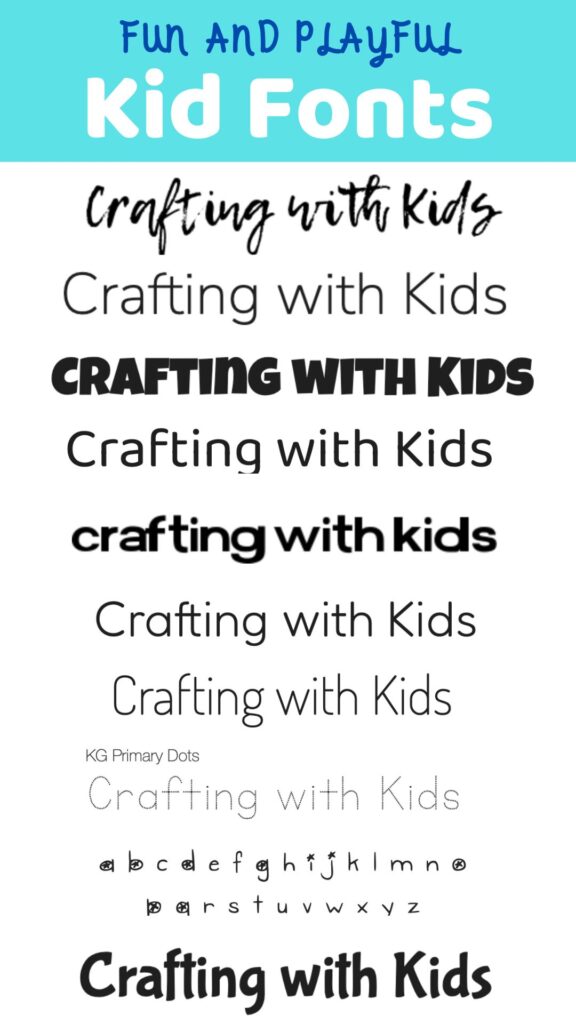
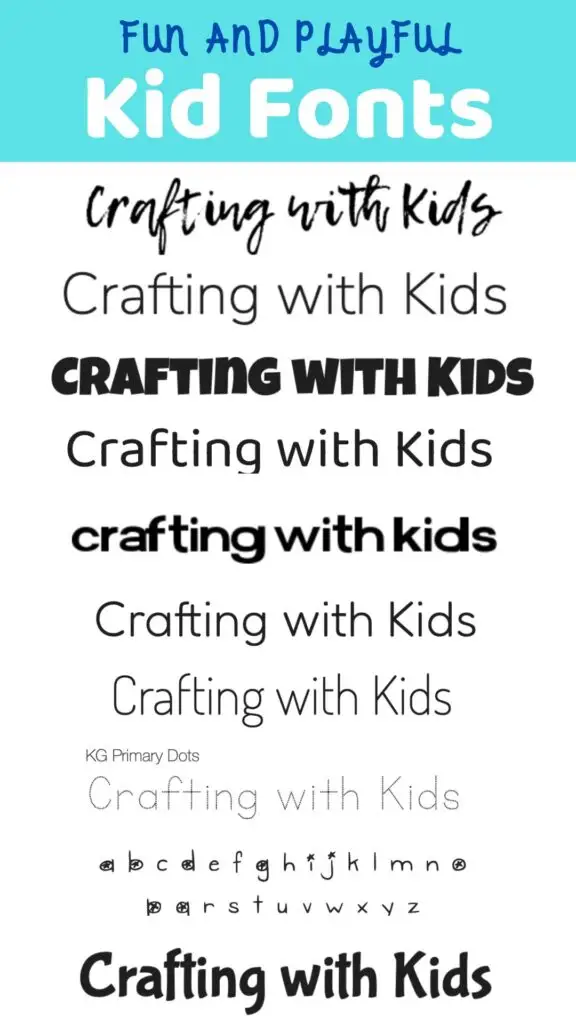
Below we are sharing a handful of custom sample text for each font.
Handwritten And Doodle Fonts
Handwritten and doodle fonts give off a relaxed and playful feel. Their imperfect lines and casual style look like they were drawn by kids themselves. Letters might wobble or vary in thickness, giving each character a unique personality.
Doodle fonts sometimes include small illustrations, like stars or smiley faces, built into the alphabet. This adds visual interest and can match school, craft, or birthday themes. Examples include KG Primary Dots or DJB Gimme Space.
These fonts work well on posters, classroom materials, or any setting that benefits from an approachable, fun vibe. It’s important to make sure handwritten styles remain legible, even at smaller sizes or when used in long blocks of text.
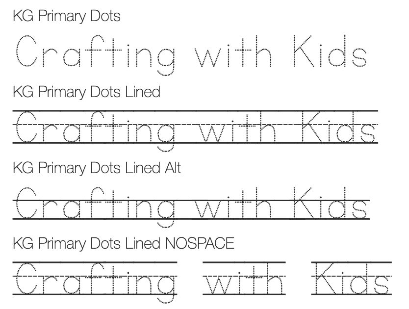
KG Primary Dots
This is an educational font family created by Kimberly Geswein in 2013. It is a good option for those wanting to practice writing and when printed, gives kids real-world projects to work on. It’s perfect for teachers, this font has enough glyphs to cover 80+ languages and extra math symbols! It is neat and legible for early readers! It is not a free font, and you do have to purchase it to use it.
DJB Gimme Space
This is a cute font that looks like you’ve doodled in it. The link above shares a free download for personal use of this font. This font really has a playful touch.

Bubble And Rounded Fonts
Bubble and rounded fonts stand out for their softness and friendly look. Letters in these fonts are wide, smooth, and circular, often resembling bubbles or balloons. The style makes words appear gentle and inviting, which can appeal to both toddlers and early readers.
Common choices in this group are Comic Sans, BubbleGum, and Baloo. These fonts are frequently used in toy packaging, children’s product labels, and event invitations.
Some versions may use black outlines, color fills, or even a slight 3D effect to make the words pop. These extra touches boost visual impact without making things hard to read. Bubble fonts are also a favorite for headings or short bursts of text.
Comic Sans
It was originally developed for use in Microsoft’s software, and since then has become very widely recognized for its use in casual contexts such as children’s books. This is one of the most popular fonts for kids today.

BubbleGum
According to Google Fonts “Bubblegum Sans is upbeat, flavor-loaded, brushalicious letters for the sunny side of the street. It bounces with joy and tells a great story.” This is very much a bold font!

Baloo 2
Baloo is an affable display typeface by Ek Type. This is a very easy to read font that, in a way, jumps off the page when you read it.

Playful Serif And Sans-Serif Options
Serif and sans-serif kid fonts are adapted from classic text styles, but given a playful twist. They might include exaggerated serifs, uneven lines, or bright color suggestions. The goal is to mix readability with a bit of whimsy.
Examples include FunZone for playful serifs or Lemon Tuesday for sans-serifs with friendly, curved edges. These styles often get used in educational books, story titles, and app interfaces for kids.
FunZone
This is a “fun” font that is free for personal use. You can see it below. It also says “maybe free for commercial-use” fonts.

Lemon Tuesday
This is also a fun font that is free for personal and commercial use!

More fun fonts for kids
Here are a few more fun fonts because “kid friendly” fonts make things easy to read and less frustrated readers = happy kids!
Fredoka
This font is light and airy and has thin strokes.

Luckiest Guy
This is a bold font with a unique look. Every letter is a capital letter. I’m not sure I love the “all uppercase letters,” but it’s good for a certain look. It might be harder for younger kids to read.

Dosis
This is another light and airy font and what I would call a “friendly font.”

Nunito
While this font is very similar to Dosis, it’s slightly different too. I would say it’s a bit easier to read than Dosis, and makes it more suitable for younger kids. While they are related styles, they are different in their own ways.

Choosing The Best Kid Fonts
Font choice can mean the difference between an engaging design and a confusing one. Style, clarity, and age-appropriateness all play major roles in which kid font works best for any project.
Age Appropriateness
Selecting fonts that fit a child’s age group helps keep readers interested and supports learning. For younger kids, rounded, simple fonts—like Comic Sans and Baloo—are easier to recognize. Many early education materials use fonts that mimic handwritten print to reinforce letter formation.
Older kids can handle fonts with more detail, but they should still avoid anything with too much flourish or distortion. For preteens, slightly more stylized fonts like Luckiest Guy or Fredoka can add personality without getting hard to read. Keeping the target age in mind prevents confusion and keeps the experience positive.
| Age Range | Recommended Font Style | Examples |
|---|---|---|
| 3-6 years | Rounded, simple, clear | Comic Sans, Baloo |
| 7-12 years | Friendly, modern, bold | Fredoka, Luckiest Guy |
| 13+ years | Clean, expressive, stylish | Nunito, Dosis |
Fun Versus Formal Looks
The style of a kid font sets the mood for whatever kids are reading or creating. Fun fonts, using bright colors or playful letter shapes, can spark imagination and draw attention. These are great for invitations, birthday cards, and games.
Formal fonts, which look more like standard print, are better for learning activities, worksheets, and storybooks. They support reading skills and communicate information clearly. It’s smart to use fun fonts for headings or short phrases, while sticking to more formal fonts for body text where longer reading is needed.
When balancing fun and formal, designers think about the content, age group, and reading level. A mix of both styles can make materials both appealing and functional without overwhelming the page.
How To Download And Install Kid Fonts
Downloading and installing kid fonts is usually quick and straightforward. It’s important to choose trustworthy font sources and follow safe installation steps to keep the process simple and secure.
Finding Safe Font Sources
The best places to find kid fonts are well-known font websites. Sites like Google Fonts, DaFont, or Font Squirrel have large selections and make it easy to preview and check font licenses.
Look for fonts marked as free for personal or commercial use if needed. Always download from the official website, not third-party links. Malware sometimes hides in font files from questionable sources.
Most font sites show details like style, category, and license in a clear table or box on the font’s page. Here’s an example of what to check before downloading:
| Site | License Info | Preview Options | Download Safety |
|---|---|---|---|
| Google Fonts | Open-source | Yes | Very Safe |
| DaFont | Various (check) | Yes | Safe (check lic.) |
| Font Squirrel | Verified Free | Yes | Safe |
Installing Fonts On Your Device
The installation process is different depending on the device’s operating system. On Windows, fonts are usually distributed as .ttf or .otf files. Download the file, right-click, and choose Install. On macOS, double-click the font file and click Install Font in the Font Book app.
For Chromebooks, fonts can only be used in certain graphic design apps or via cloud tools.
iOS and Android users need a font manager app to install custom fonts for use in certain applications. Always restart any open programs after installing a new font so it appears in their font lists.
Some creative programs, like Photoshop or Word, might require a manual refresh or a settings update to detect new fonts. Check the user guide for your main design software if a new font isn’t showing up right away.
Customizing Fonts For Kids
Customizing kid fonts can make digital learning and fun projects more engaging. Adding color, movement, or unique shapes helps fonts grab attention and match a child’s personality or classroom theme.
Coloring And Animation Effects
Color is a huge part of what attracts kids to any text. Adding different colors to letters or words can highlight important information or group similar concepts together. Bright and contrasting color palettes generally work best, but it’s important not to overload the text, which could make it hard to read.
Some digital fonts allow animation such as bouncing letters, blinking highlights, or gradual color changes. These effects, when used sparingly, can make screens more inviting. For educational apps or games, animated letters can show sound changes or word blending in action.
Tips for Adding Color and Animation:
- Use pastel backgrounds with vivid letter colors
- Animate only main words, not every letter
- Test readability for each color choice
| Effect | Good For | Avoid |
|---|---|---|
| Color blends | Emphasizing keywords | Overlapping contrast |
| Animations | Short activities/games | Too much motion |
I hope we’ve shared a handful of useful resources for your next project, whether it be kids’ book covers, simple text prompts or any other children-themed designs!